The question was whether it was easier to build a Summary Portfolio Timeline in SSRS as opposed to the technique detailed in his post.
I am by no means what you call a SSRS Developer, but I guess I know enough to be dangerous 🙂 With that knowledge, I am happy to say that it is very easy to build this kind of graph in SSRS, as you will see below.
In this post, I will use Report Builder, but if you are a more accomplished SSRS guy, you probably will use the BI Development Studio for the same. I will also assume that you know some basic SSRS stuff.
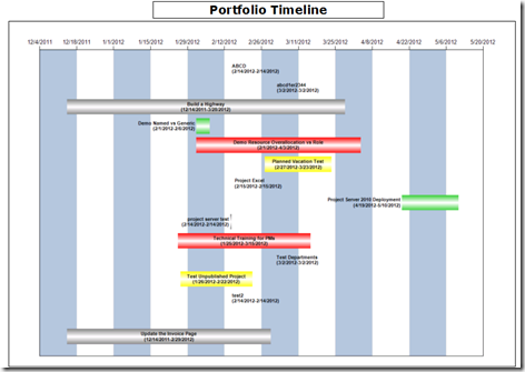
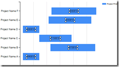
The finished product might look like this.
So, lets get moving.
Step 1: Configure your Reporting Data Source and Dataset
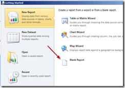
- Start by creating a new Report Builder Report, and selecting a blank report.
- Configure your data-source to point to the Project Server Reporting Database.
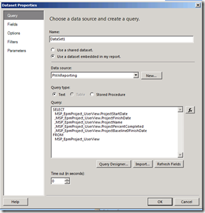
- Configure your dataset
- Select the options as shown below, and paste the query given below, and click OK.
SELECT
MSP_EpmProject_UserView.ProjectStartDate
,MSP_EpmProject_UserView.ProjectFinishDate
,MSP_EpmProject_UserView.ProjectName
,MSP_EpmProject_UserView.ProjectPercentCompleted
,MSP_EpmProject_UserView.ProjectBaseline0FinishDate
FROM
MSP_EpmProject_UserView
Step 2: Build the Timeline Chart
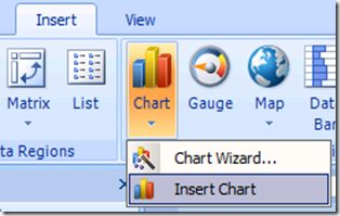
Once you have the dataset configured, click on Insert >> Insert Chart
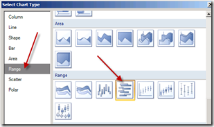
Draw on the report area where you want to place the chart. This will bring up the chart menu. Select the Range Bar Chart from the options.
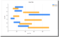
This will insert a blank Range Bar Chart on to the report area.
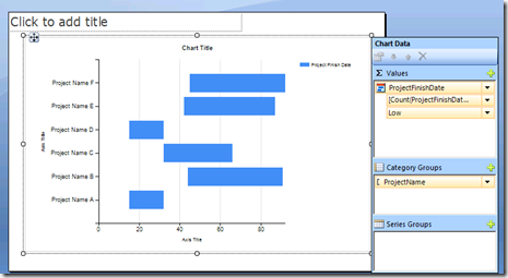
Now click somewhere on the chart area to display the Chart Data options
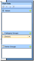
For the Category Groups Section, drag and drop the Project Name field into the empty space.
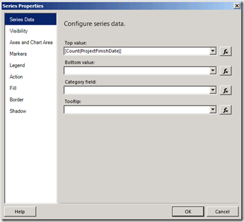
For Values section, drag and drop the ProjectFinishDate field into the area. This how your screen will look at this point.
Now right click on ProjectFinishDate and click on Series properties, which will bring you to this screen.
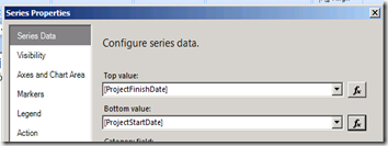
Now adjust the fields as shown below (use the fx icon besides the fields to make changes.)
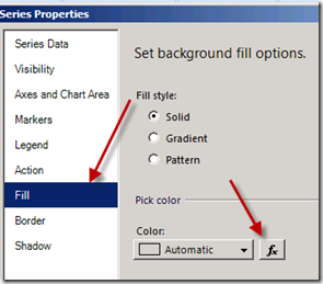
Click on Fill on the left side menu, and click on fx besides the Color Field
In the function field, paste the expression below.
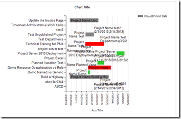
This expression will code the bars Red, Yellow or Green based on the difference between Baseline Finish Date and Current Planned Finish Date.
Step 3: Showing Data Labels
Lets add some data labels that can be displayed on the bars itself
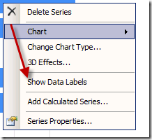
- Right Click on any of the bars, and select Series Properties, and select Show Data Labels
This will display the Data Labels as below.
Right Click on any data label and select Series Label Properties
Click on the fx icon beside the Label Data option
In the expression box, paste the following query
You will end with something like this.
Now go ahead and clean-up the chart, add embellishments and so on. A possible final out put is given below.
From here on, you could make ‘n’ number of customization to make your report look more professional including adding date ranges, color coding, add a Today line and so on.
Enjoy!





December 11, 2013 at 9:02 pm
I've used this twice in my career. It's a solid walkthrough. Thank you soo much!
February 12, 2014 at 1:42 pm
Glad it was useful!! 🙂
July 26, 2015 at 2:58 am
I was actually searching how can we create portfolio time line using ssrs and found your post really very helpful Thank you so much for your guidance.
portfolio management company